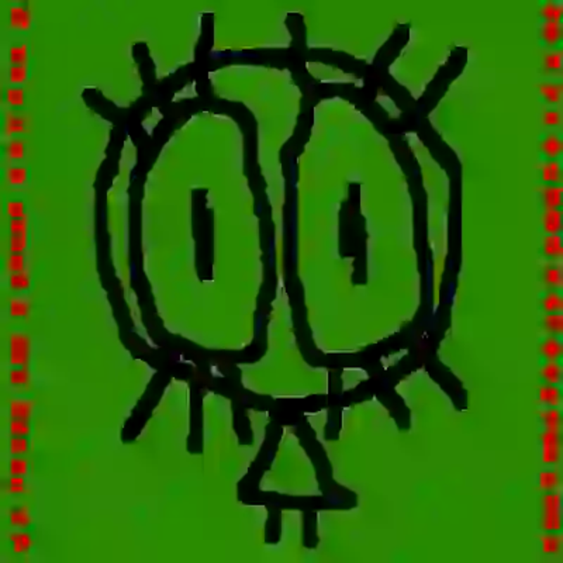
eyes.png
[August 11 2024]
I made this for my song, Washed. The girl creature thing with the eyes was something i drew in my notebook on page two. I wanted a red green and black colour pallette because that's my favorite combination of colours at the moment. I love how the blood red contrasts against the grass green, conjuring violence and nautral life together. I would hope that people can feel that i see death and life as one through this. I hope that the slightly creepy, slightly cute creature similarly resolves its own contrast as one because fear and love are so near that to expect one without the other is unnatural and harmful.
The picture and song really only connect a little through how i got those beautiful chords to sound harsh and how artists who run out of creative drive and become complacent is tragic only through the missed oppertunity of beauty.
To get that watery texture in the image, i washed the file. I initially exported it as a .webp file with as much compression as my program allowed. I upscaled the image to double the pixles in a .png format for format compatibility.
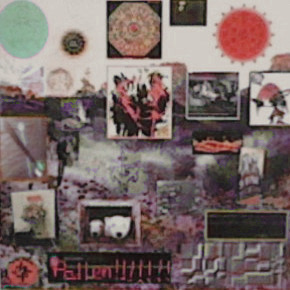
pollen.jpeg
[7 June 2024]
I made this for my song, Pollen. I had the origional image -a collage of symbols and art- from a playlist i made in may. I put together that collage as a study on how symbols, abstract expressionist art, philosophical/religous diagrams, and miscellaneous select images (meant to represent content you'd see on the internet) all interact when competing for your attention in one image. For the song cover, i thought the flowers and mess of information fit perfectly with the concept i had for the song. I took a picture of the collage on a nintendo 2DS, exported it to my computer, edited the image a little, and added the title. I used the image compression from all that exporting as a way to pull the image together more in a way that i felt matched the sound of the song.
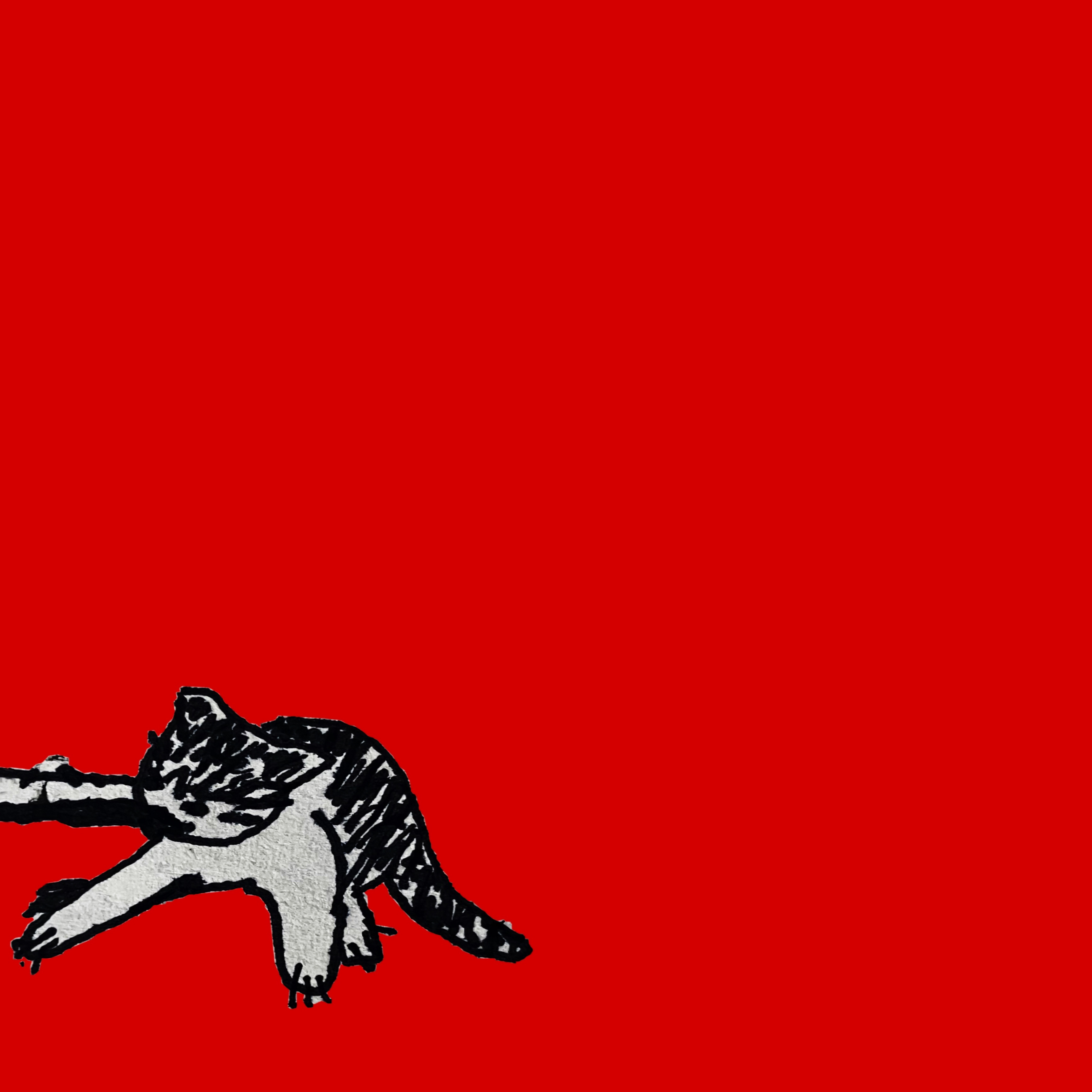
scraps.jpeg
[22 April 2024]
I made this for my song, Scraps. There's not much meaning to it but i love how it looks. Especially with how the clean red contrasts with the paper texture of the little cat in the corner, fighting for a fish. I drew the cat based on an image i saw on the internet, scanned the drawing with my phone, cut it out, and put it on red because that was my favorite colour. I had 2 versions of the drawing (this one, and a worse drawn one which i thought looked more like it was moving) and got help from an artist friend on which to pick. I wasn't going to go for the one they picked before they said but i trusted their taste and looking back they were definetly right.
